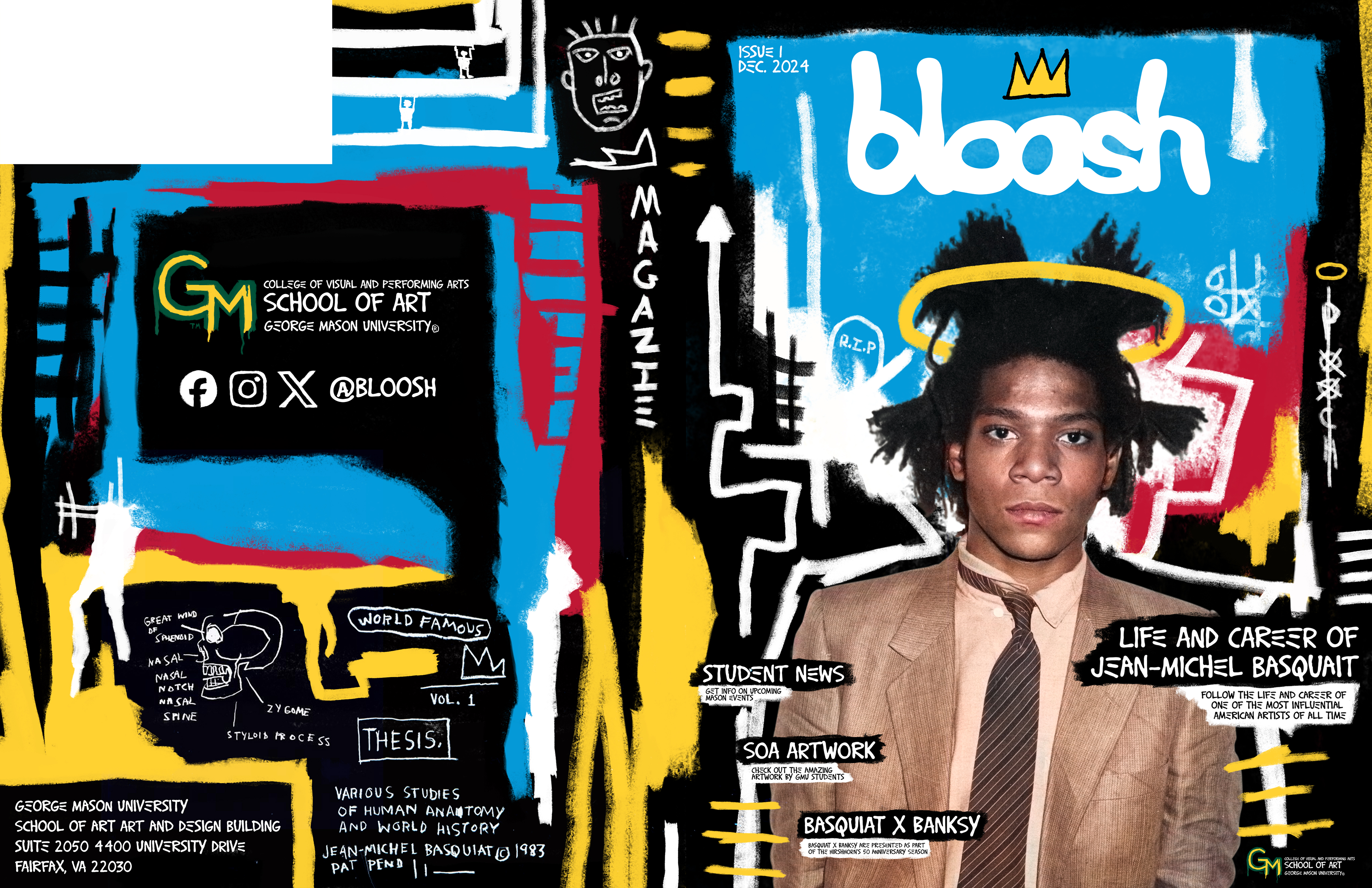
Bloosh was a group project in Editorial Design where we had to create a magazine for the George Mason school of art while also featuring an article on a famous artists dead or alive. The first step in the project was coming up with a name for the magazine, as a group we started coming up with a list of random names and we all agreed that “Bloosh” was the best one out of the list we came up with. We then had to decided the famous artist we wanted to feature. I was very adamant on choosing Jean-Michel Basquiat because I was confident that I could create an amazing spread that did is artwork justice. After some convincing, my group mates agreed on choosing him as the main artist.
Once we got all the boring stuff out of the way we could finally being designing. Rather than choosing one person to design the logo we decided we would each make one and we would take a vote on who’s would be the one to represent Bloosh. Once we all finished our logo’s mine was the one that got chosen. I took a different and unique approach to making this logo. I usually sketch my ideas out, but for this one I had the idea in my head as soon as we landed on the name. I wanted to make the letters bubbly and inviting, so my first step was to find a good typeface as a base, then in Photoshop I used the liquify tool to continuously reshape each individual letter until I felt they were perfect.
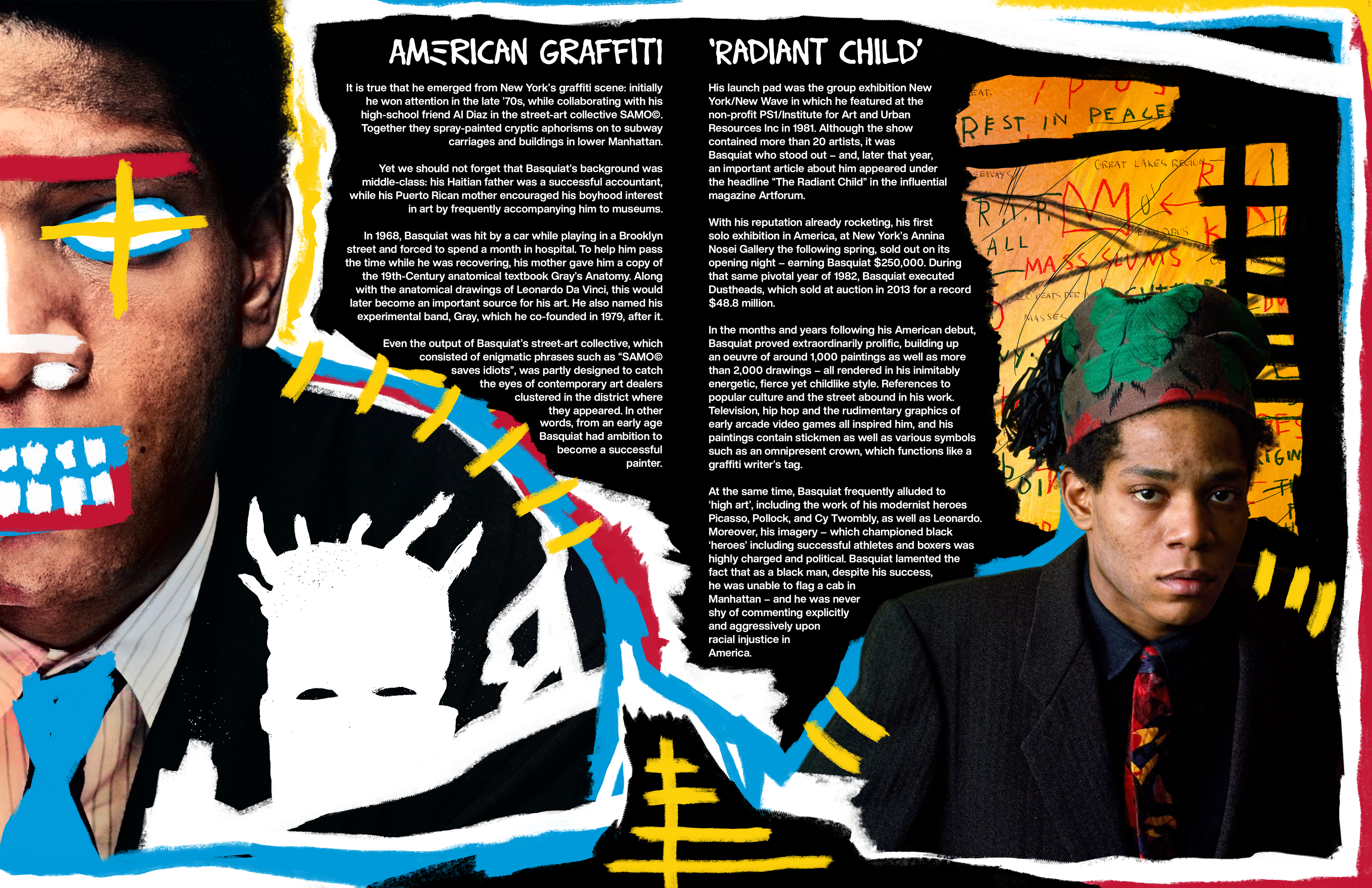
Once the logo was done we delegated the rest of the project out, I was in charge of creating the cover and the spread featuring Jean-Michel Basquiat. I took the same approach when designing them both. I wanted to create something that represented Basquiats unique artistic style. I created the cover the and baseplate for the spread in Photoshop using a number of different brushes to get this rough, sloppy, yet controlled look, as well as some of Basquiats amazing pieces of artwork. To finish off my portion of the project I took my cover and spread into Indesign to added all text.
All the work featured here was my portion of the project.