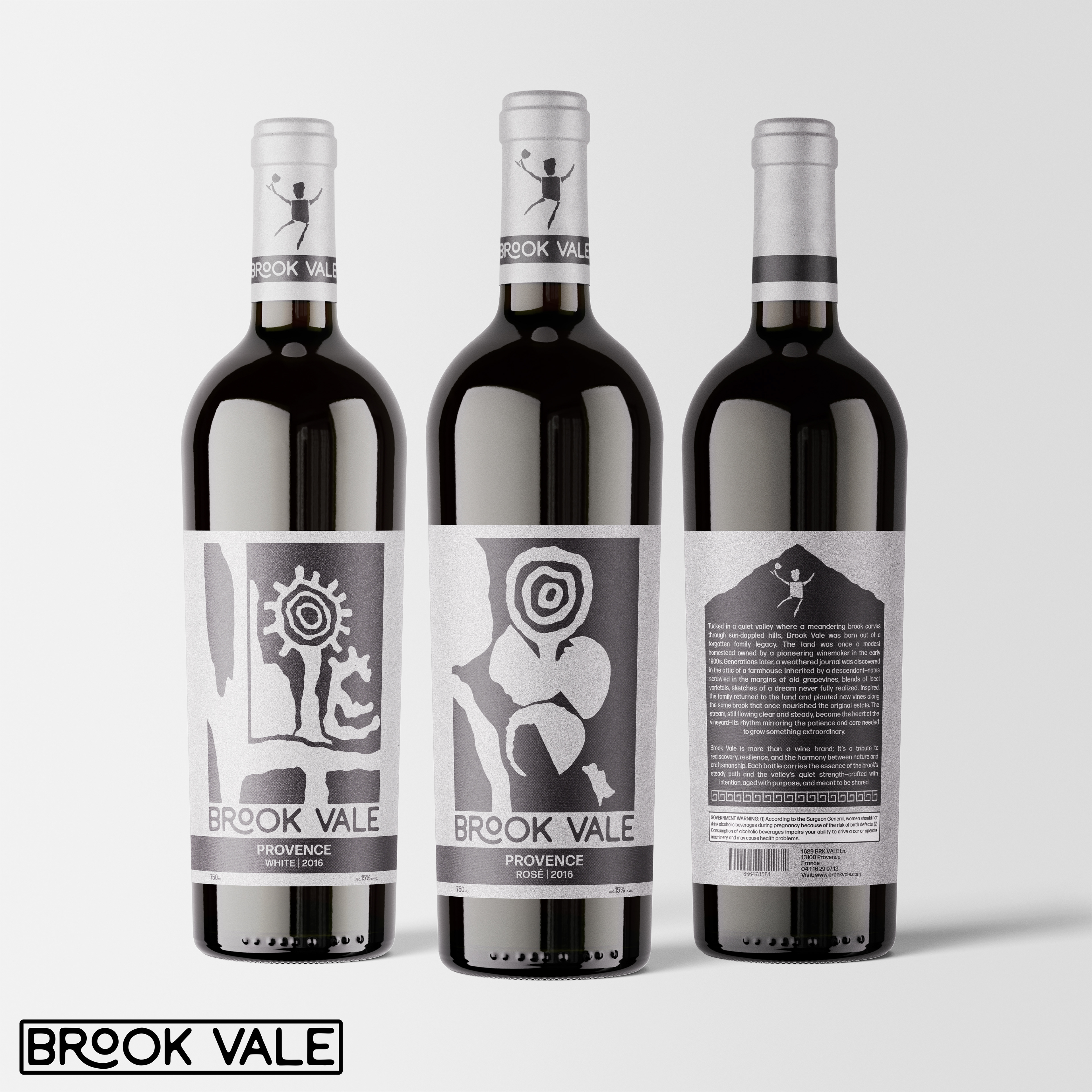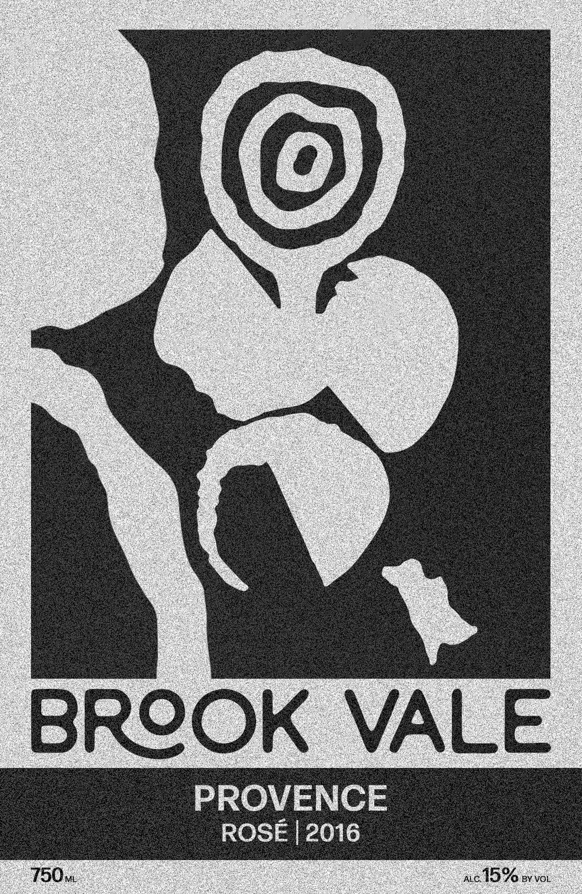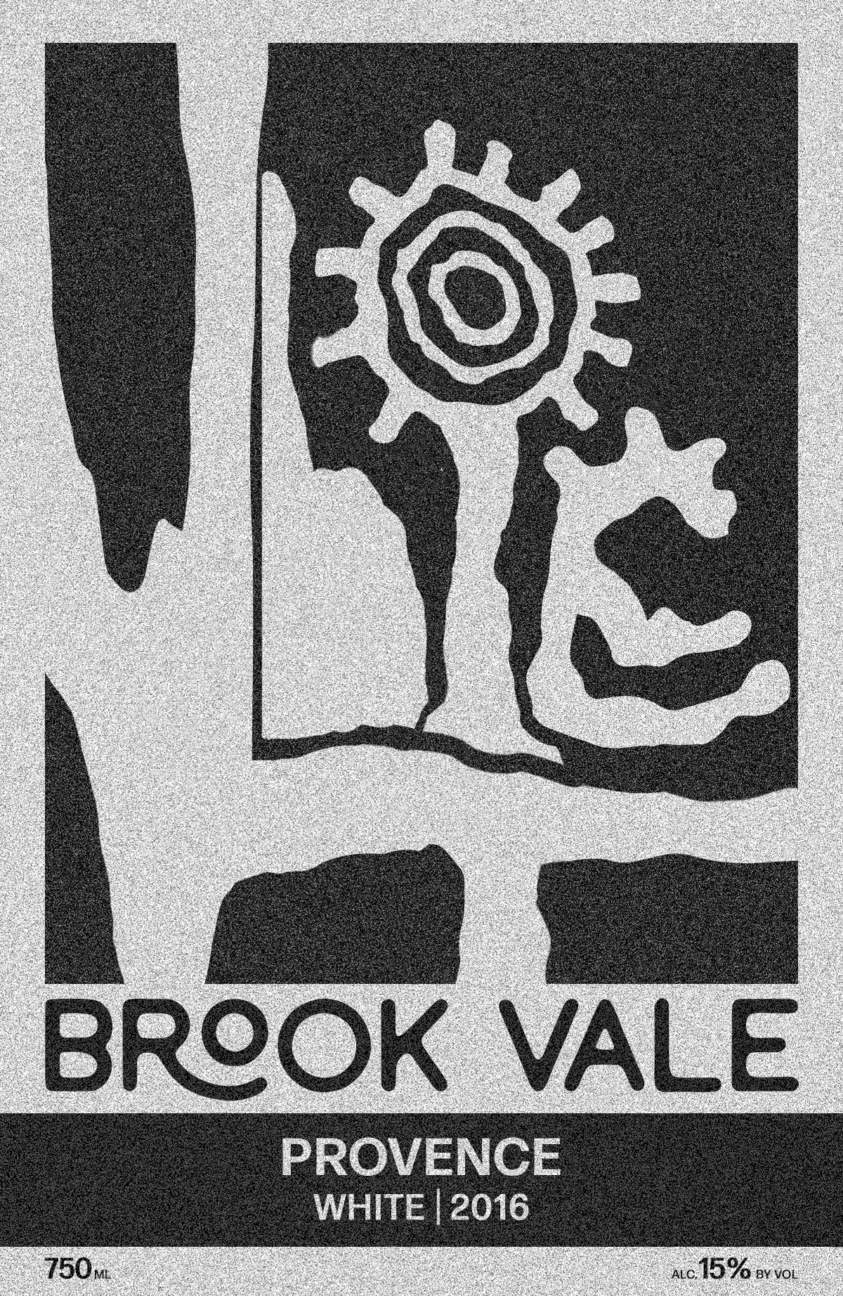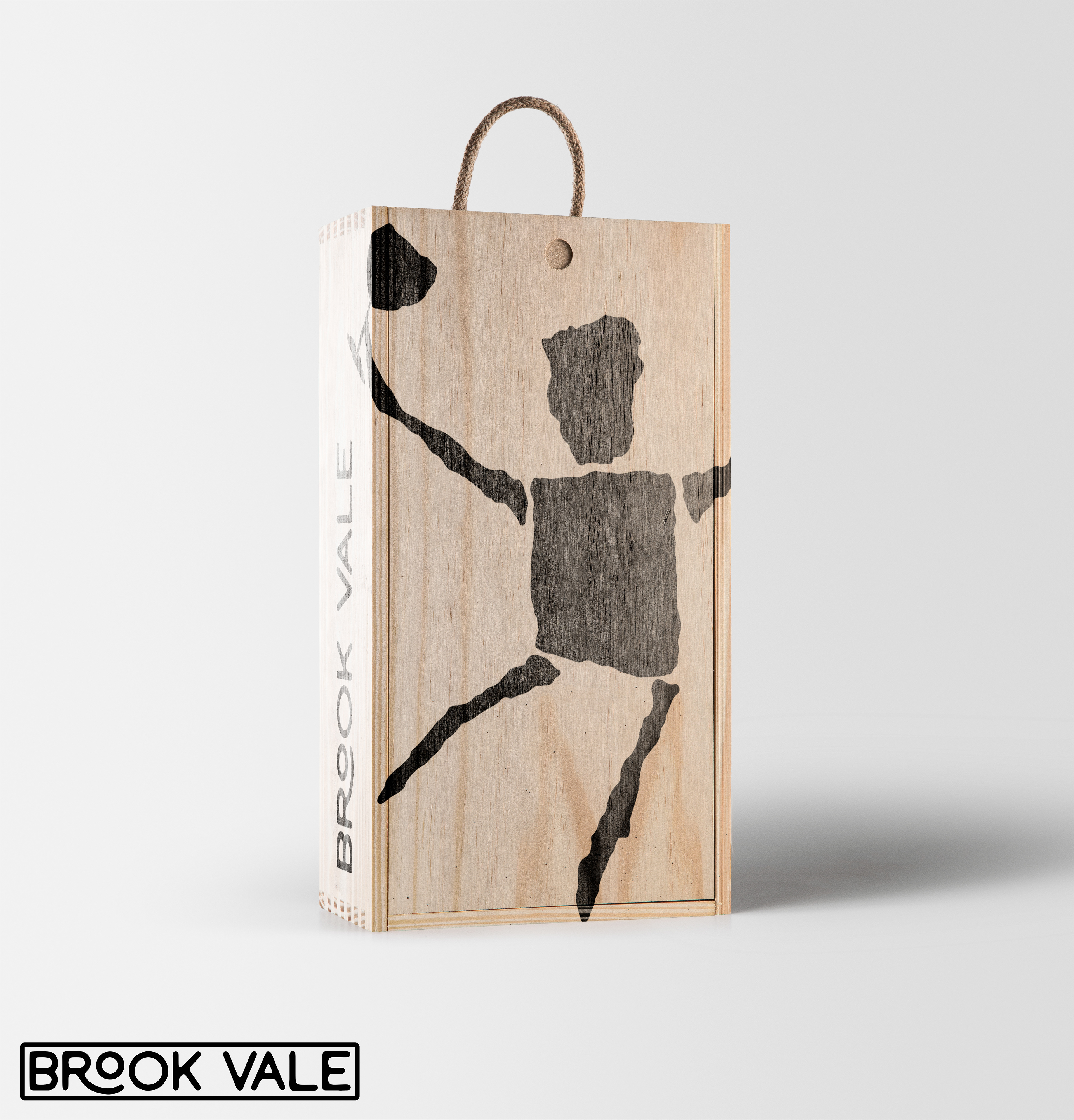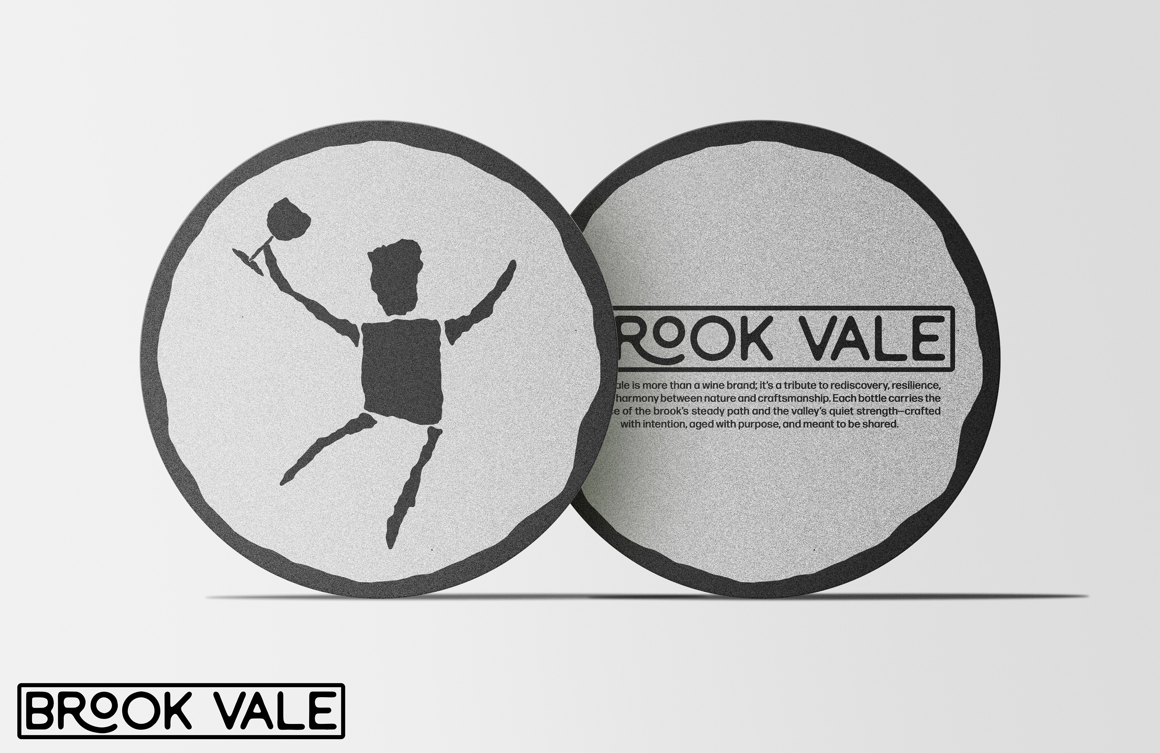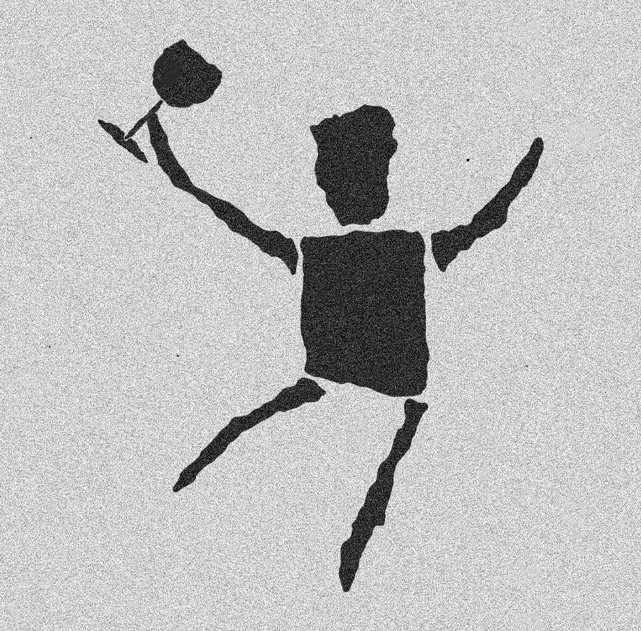
Brook Vale was a project given to me in Advance Typography where I had to create a logo, a Rosé wine label, a White wine label, and two pieces of collateral to go with it. This project is very important to me because it’s one of the first projects were I do most of the work by hand. I admittedly struggled finding a unique style for this project until I come across cave paintings which I would then use as the inspiration for this project.
The first step in this project, like many, was creating the logo. For the logo I stepped away from the computer because I knew I wanted the logo to look rough, I wanted it to look like caveman paintings, so with a sharpie I started drawing out caveman figures holding a wine glass until I landed on one I liked. Once that was done I took it into Illustrator and Photoshop to give it a few minor corrections and edits.
For the labels I wanted to take a more abstract approach. I wrote out countless different letter forms in many different, and unique ways that spelt out rosé and white for each respective label. I then scanned these letter forms into Illustrator and Photoshop and arranged them until I was satisfied with the composition. The letters aren’t meant to be easily understood or read, they are meant to create an abstract label.
I learned how to work through a creative slump with this project and I’ve taken the lessons I learned from it and have applied them to almost every project since.