Hollis House was a very unique project that I had in Advance Typography. For this project we were put into groups of 4 and given a restaurant name and what they were. We got Hollis House which is a fine dining, fancy, French restaurant. In our groups we each had to make a logo, and take a vote on the best one and then design at least 4 menus. The catch is that we each had to design our own menus individually, but we had to use the same images, colors, typefaces, and food items. This was to show how differently we can design while using the same material.
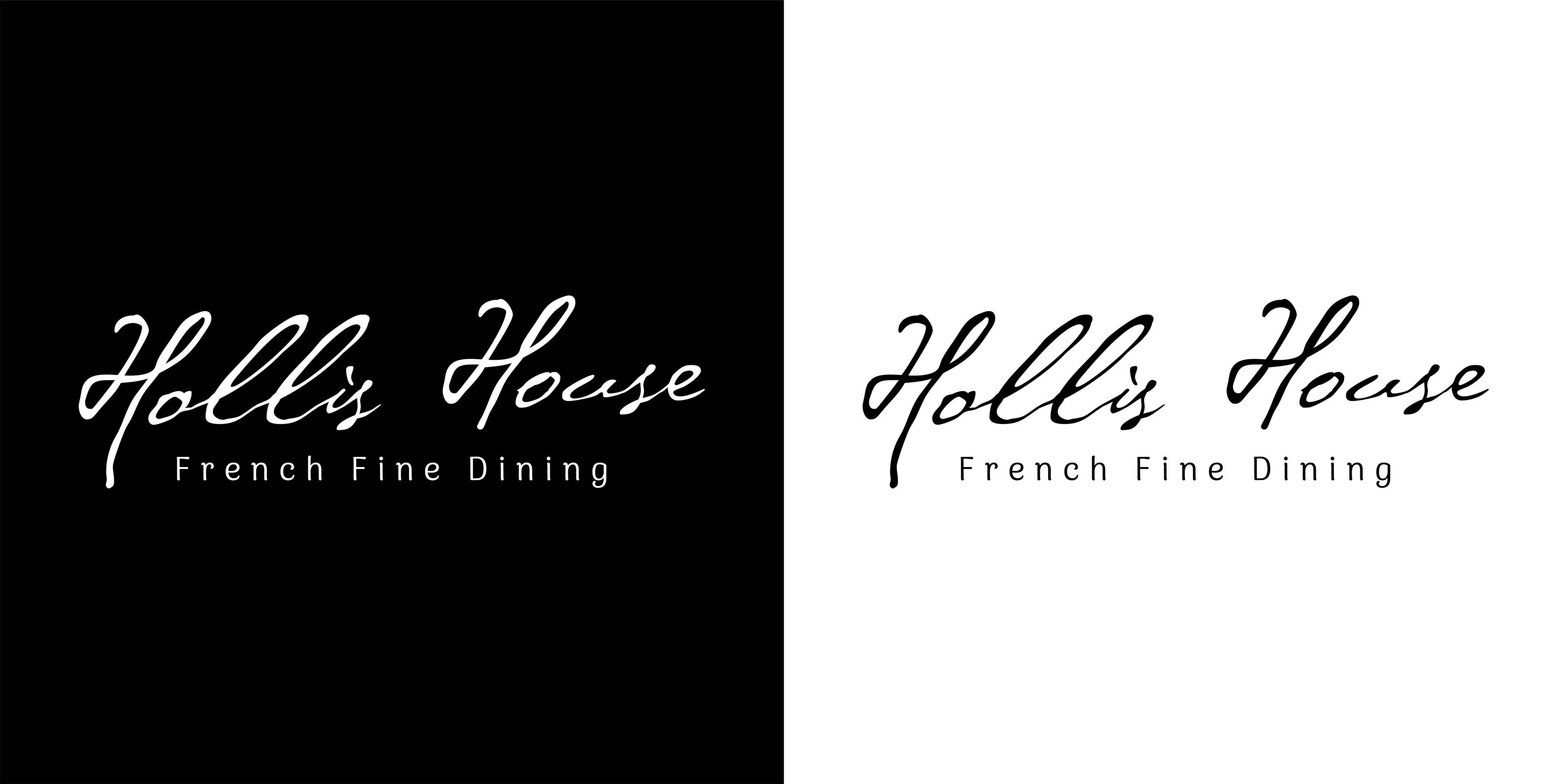
Out of the 4 logos we designed mine was the one that was chosen to represent Hollis House. When I think of a fancy restaurant I think of minimalism designs with a slight touch of “flare.” With that said I wanted the logo to represent that. I found a really nice script typeface that felt like it was written with a quill pen, I then found another typeface that I felt fit well.
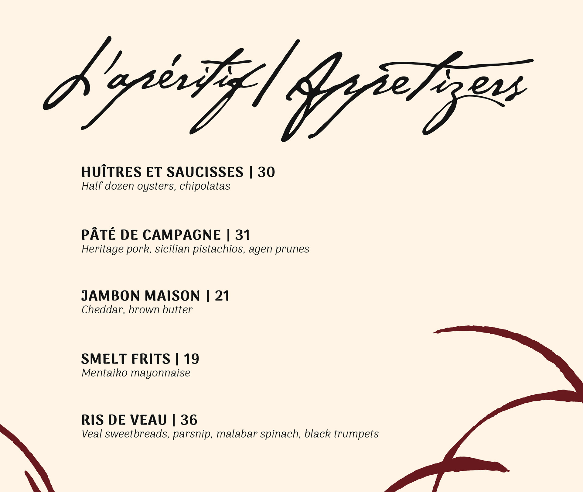
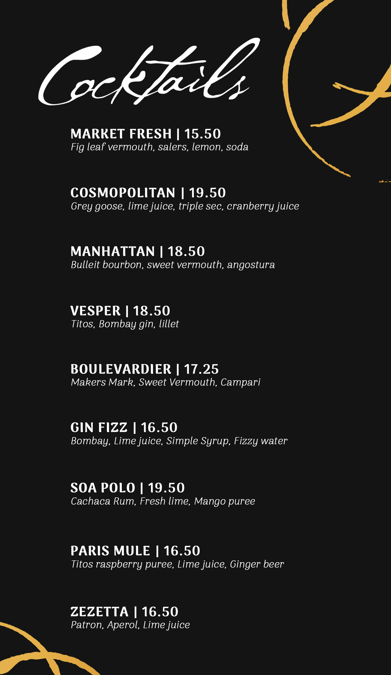
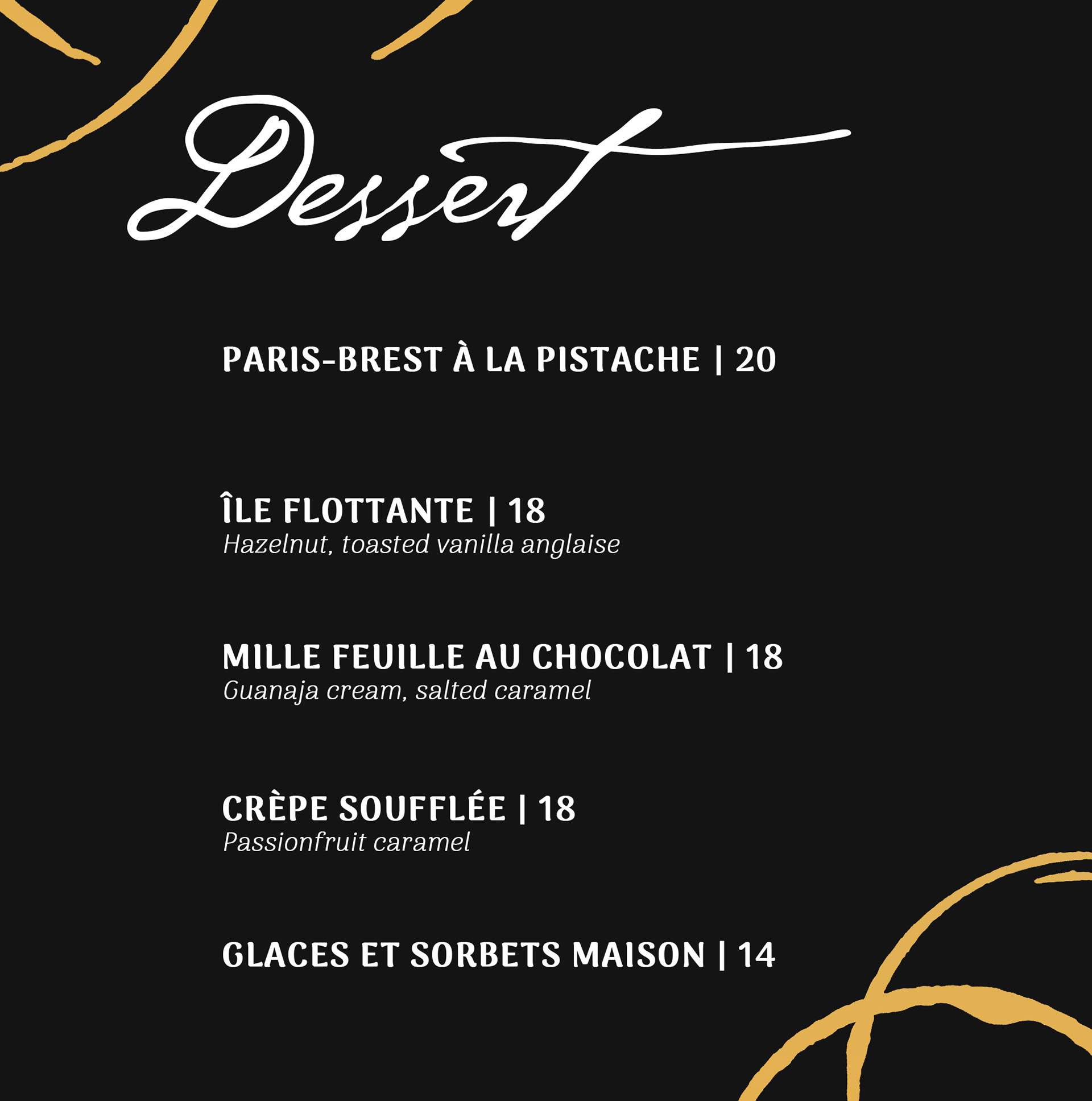
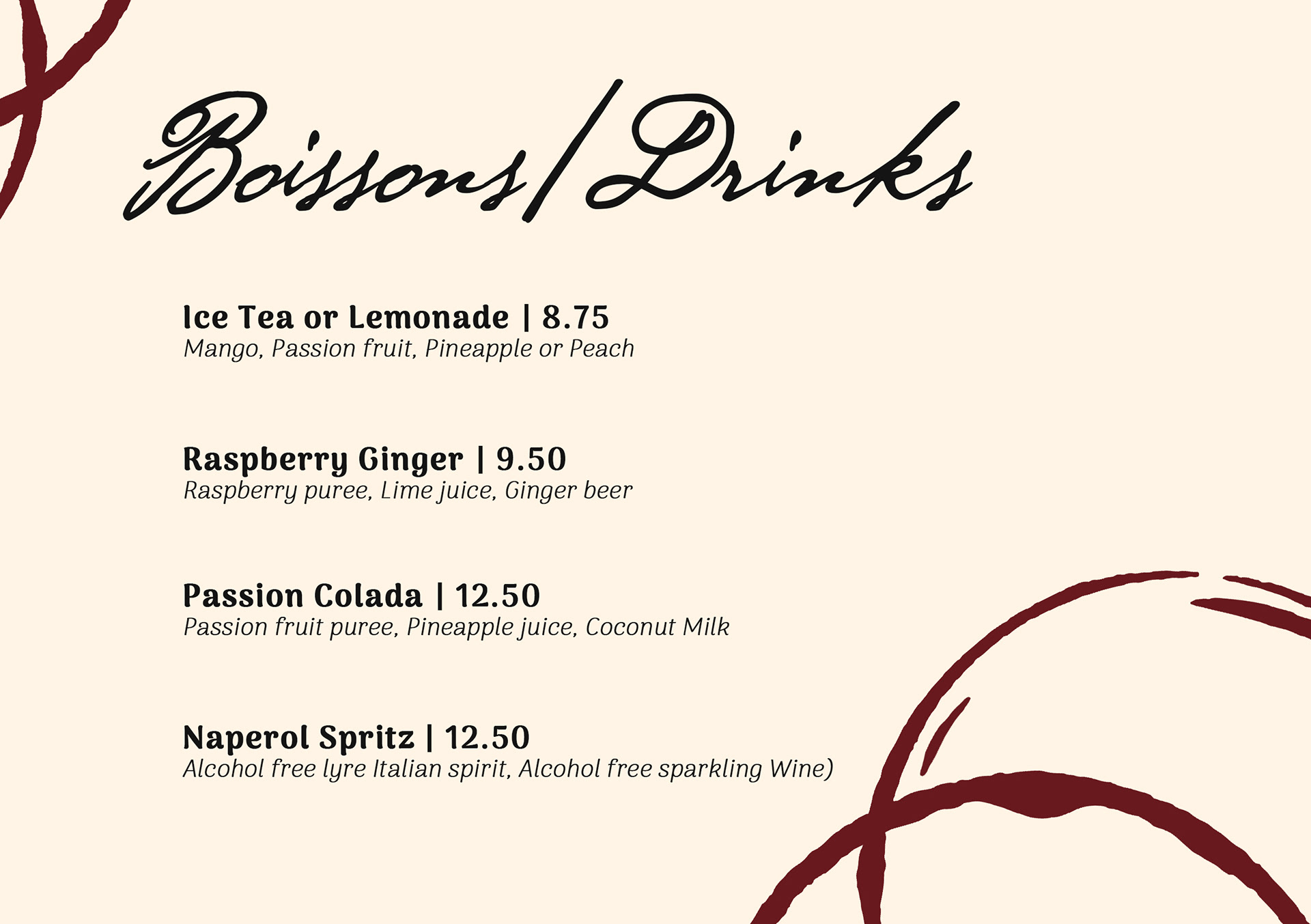
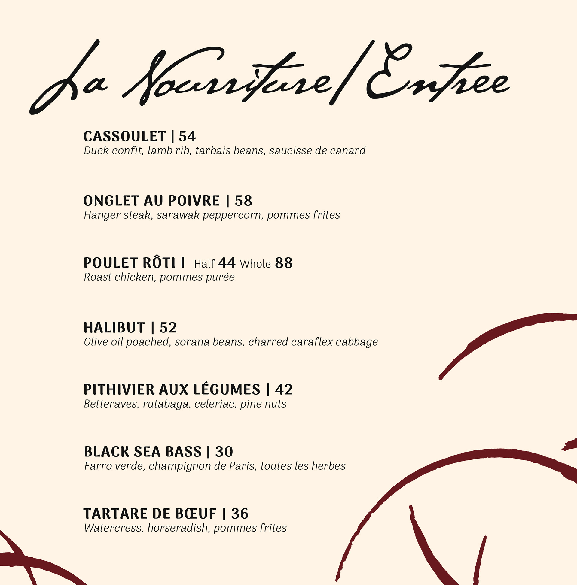
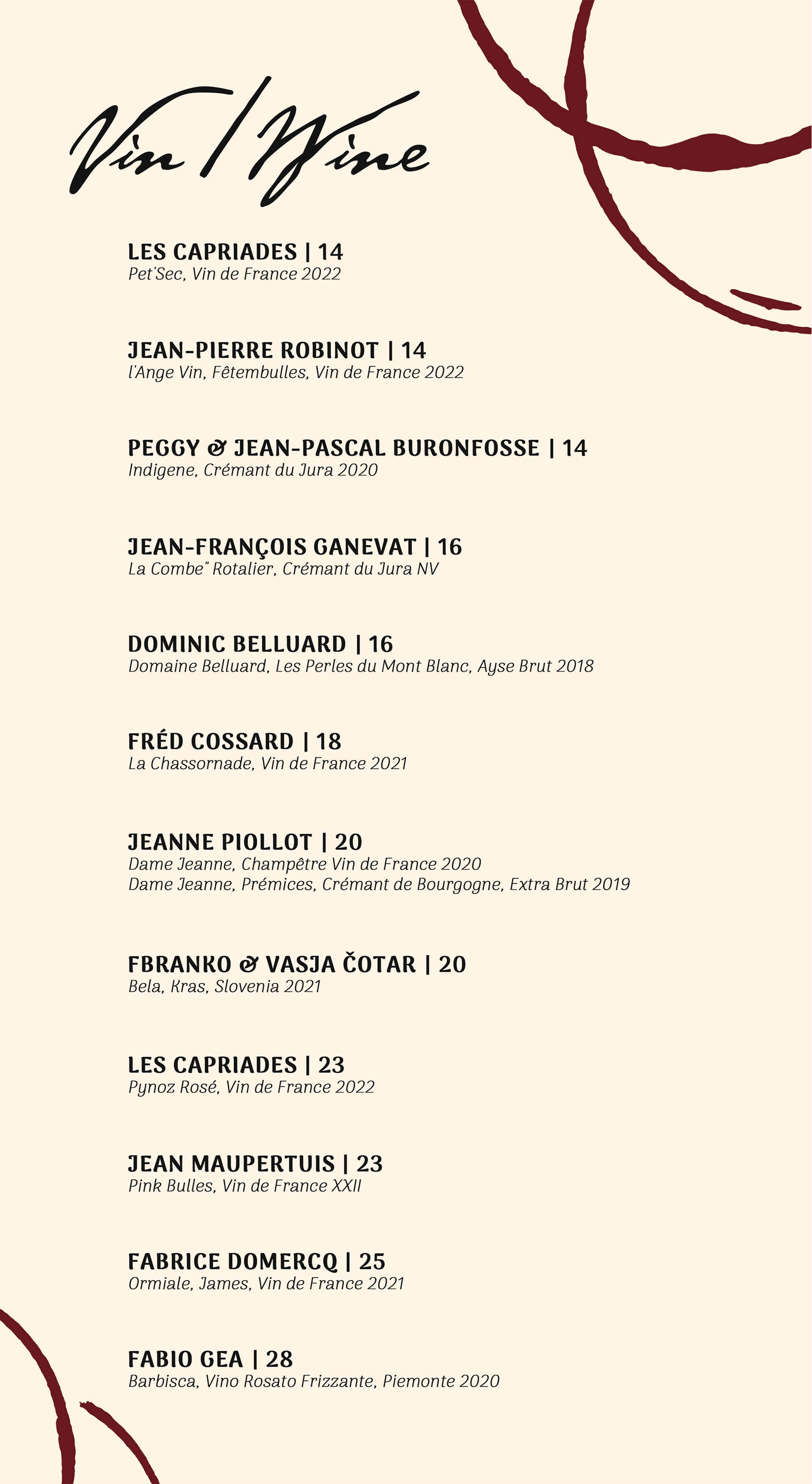
Since my logo was chosen the designs for the menus came a little easier to me because I had a good idea on what to do for them. As stated earlier we all had to have access to the same assets, so we created a Google drive where we would upload whatever assets we found that we liked. I found these abstract rings that reminded me the condensation ring that a drink leaves behind when you pick it up. They fit the minimalistic style I was going for with these menus. I ended up creating 6 menus in total, a wine, cocktail, drink, appetizer, entree, and dessert menu.