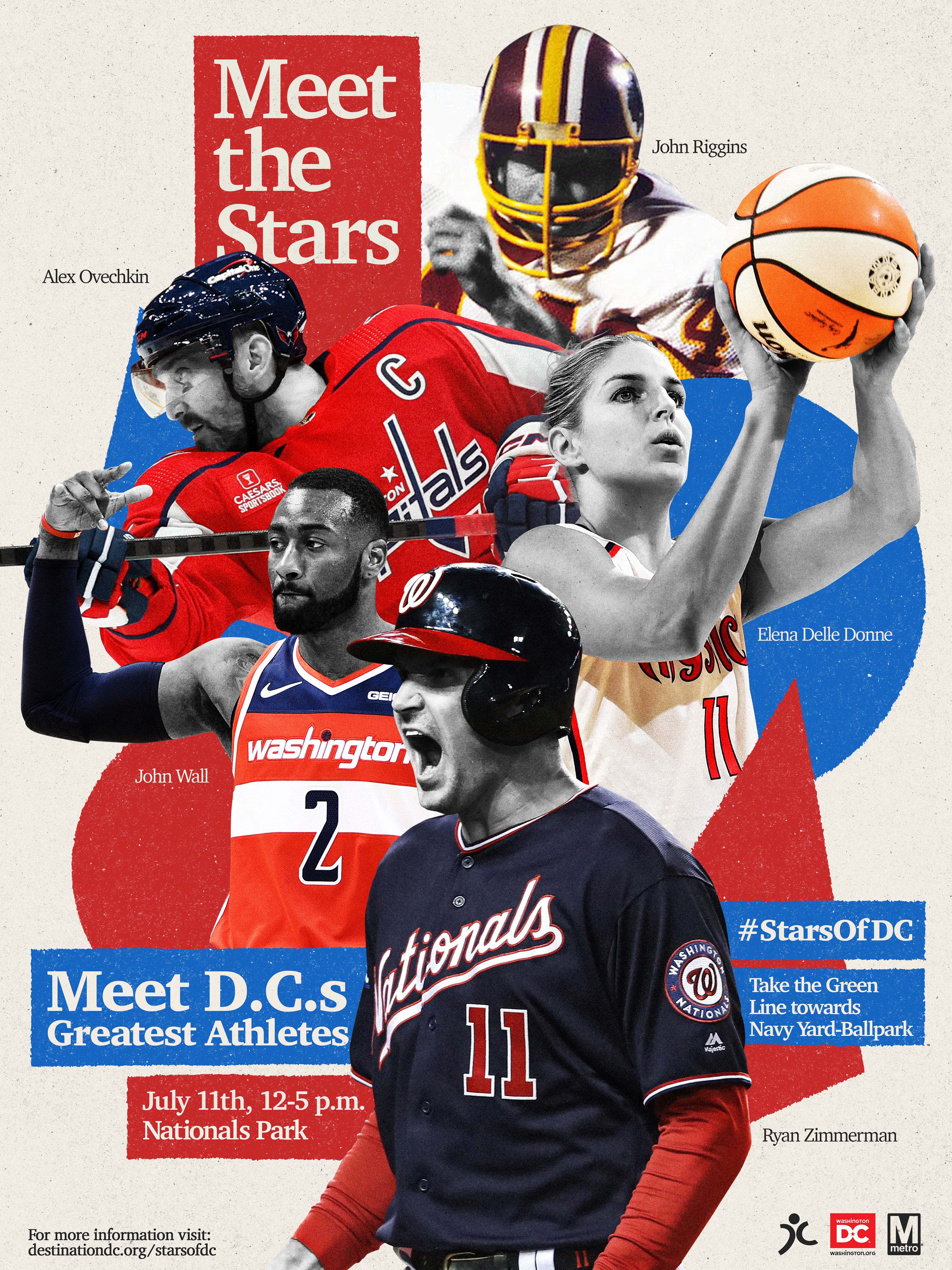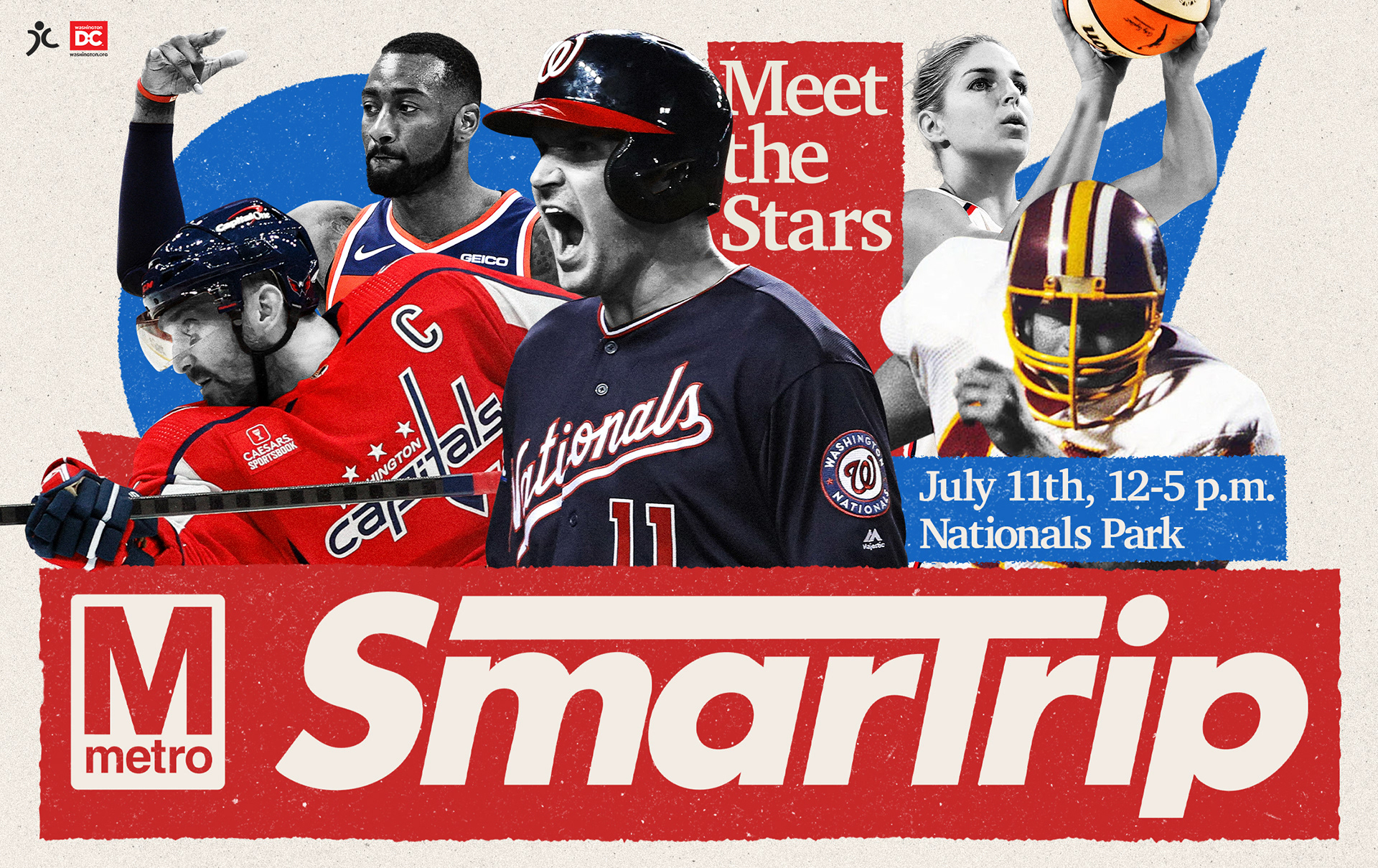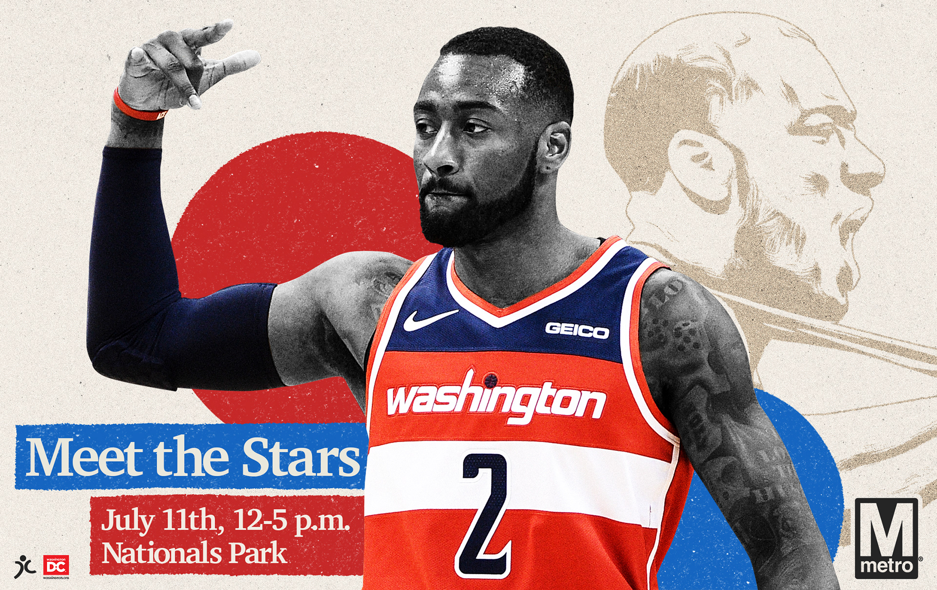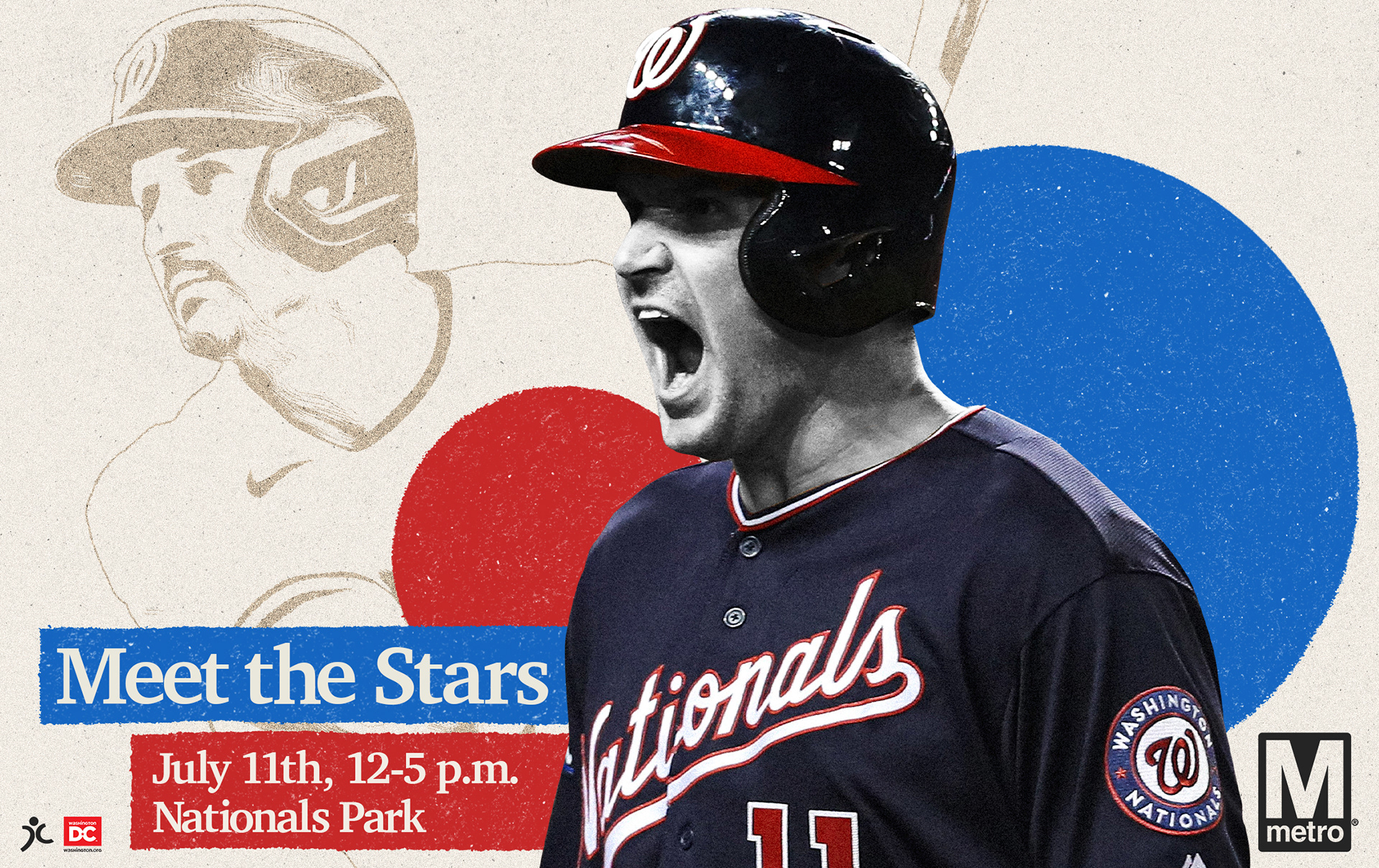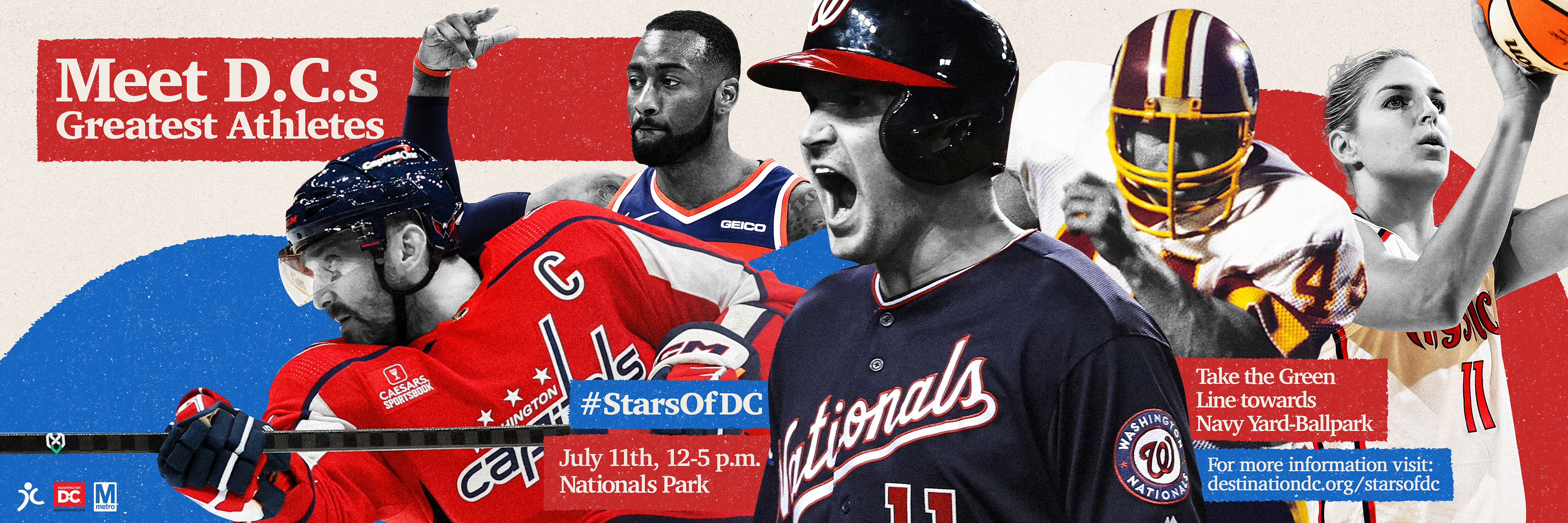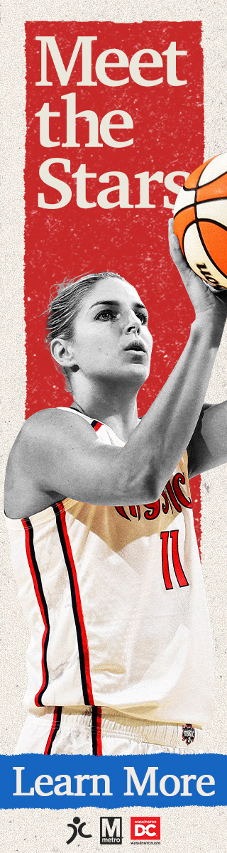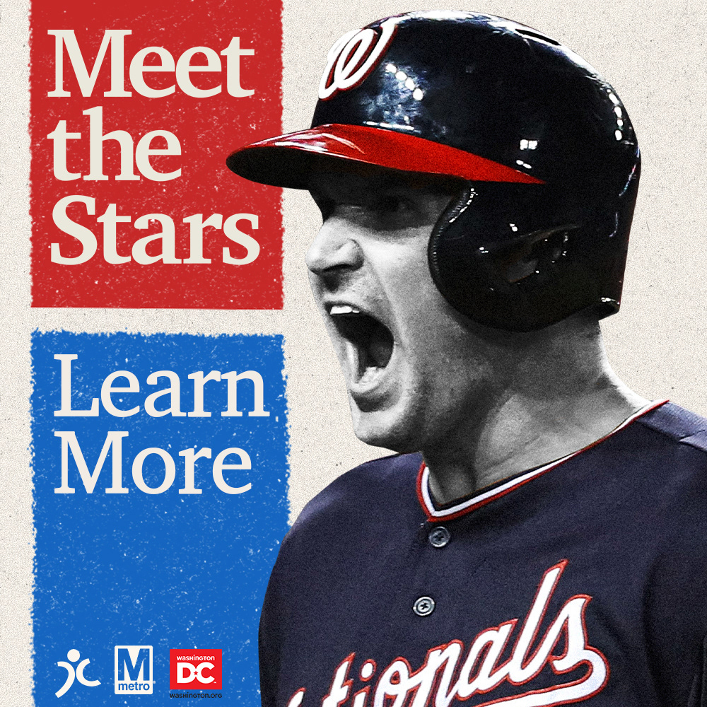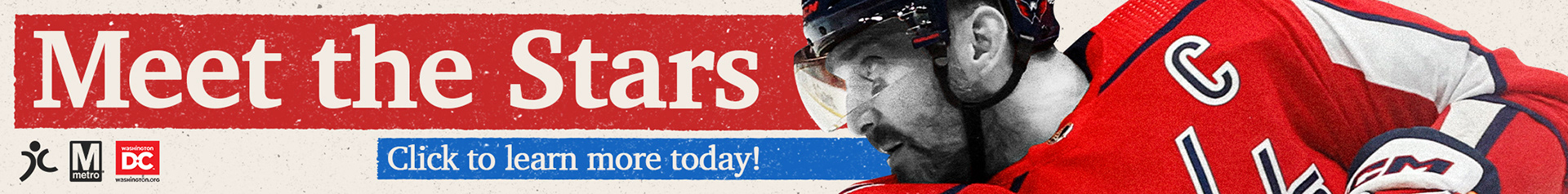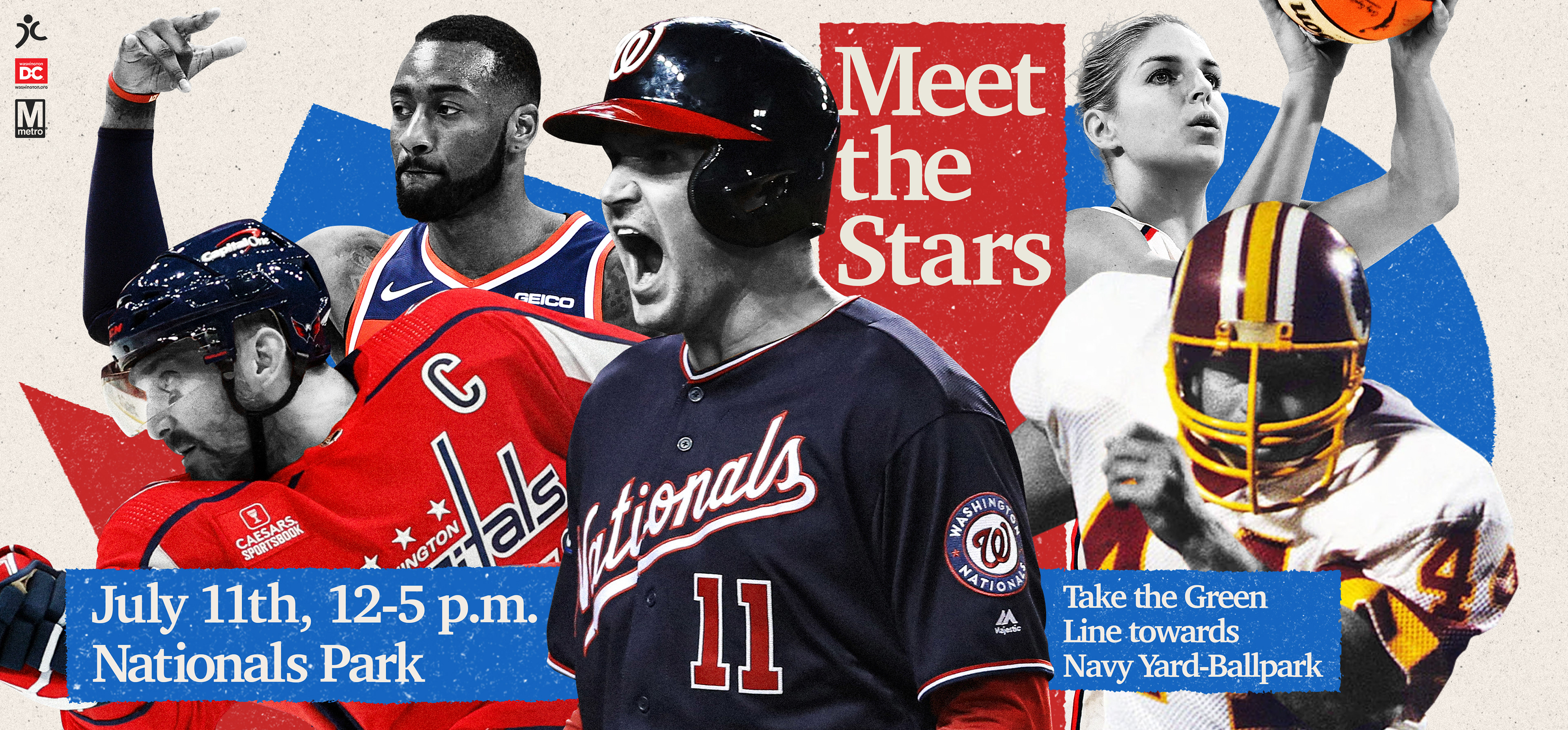
In Advertising Design I was assigned to come up with a organization designed for D.C. tourism, after some thinking I decided I would choose what I knew best about D.C., and that’s their professional sports teams. I’m from Virginia so I root for all the D.C. sports teams, whether they’re good or bad. Once I knew what I wanted the project to revolve around I had come up with a way to draw in tourists. I then come up with “Stars of D.C.”, an event where you can meet 5 of D.C.s most iconic athletes, John Wall, Ryan Zimmerman, John Riggins, Alex Ovechkin, and Elena Delle Donne.
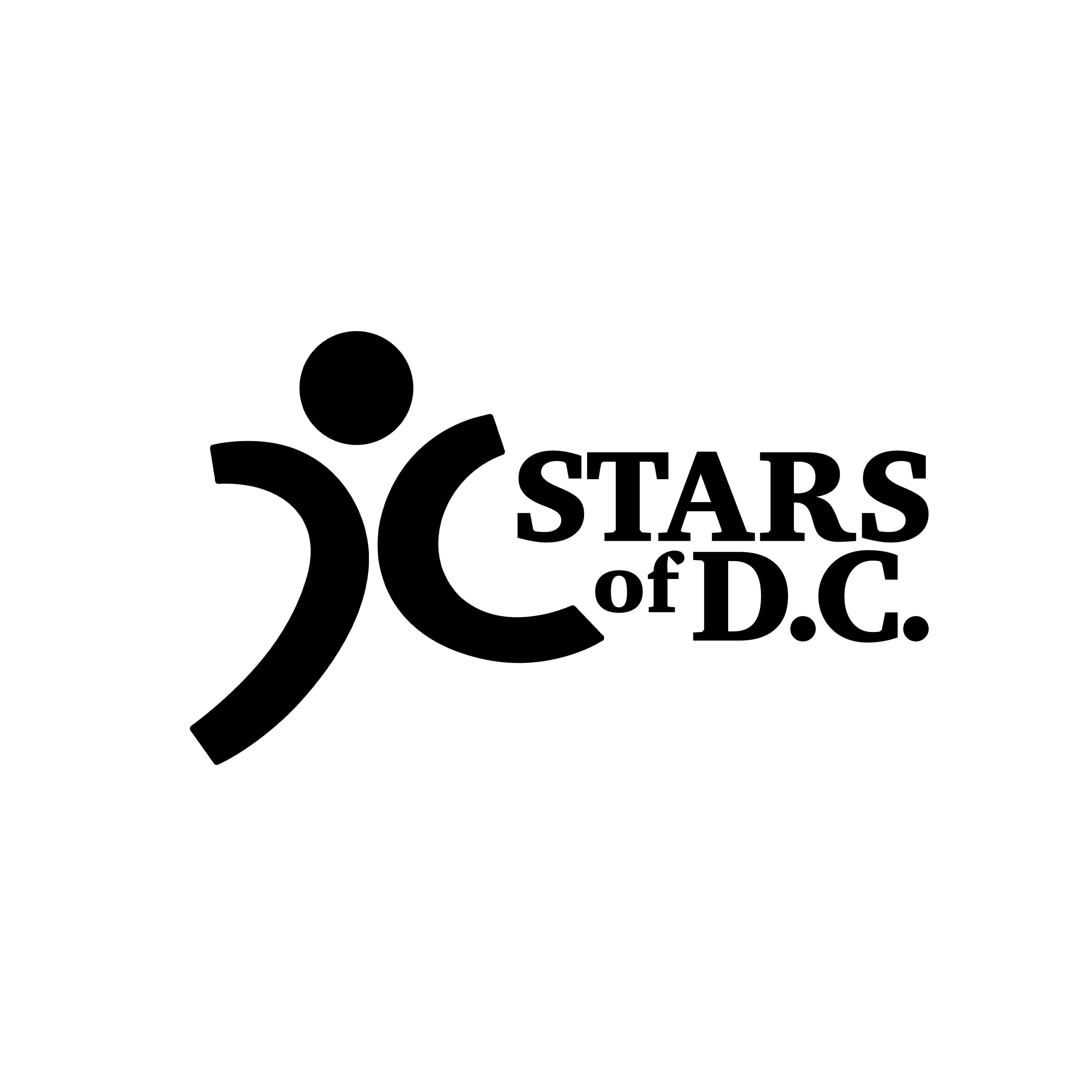
I had to design a logo, print ad (7.5 X 10), bus wrap, an instagram carousal that contains 3 individual slides, 3 Metro Smartrip cards, and 3 different sized website popup ads. I started off with designing the logo. The logo had to contain the letter D and C in it. After lots of sketching I stumbled across a design that resembles a stick figure, with the left side being the letter D with stem removed to be an arm and a leg, and the C being the other arm and leg.
Like I do with all my projects the first thing I choose to tackle after the logo was the print ad because that would determine the visual direction I would go in for the rest of the deliverables. After trying out different things I choose to go with a collage style. I did the majority of this project in Photoshop because it allowed me to make use of a lot of features that I love. In particular displacements maps. I used displacement maps on every nearly everything except for the logo. I utilize those to give the edges a nice texture, in conjunction with the grain I used on all the photos of the athletes, and the textures I overlayed on the project. For the color palette I choose to go with red and blue because that represents all the major D.C. sports team apart from the Commanders.
This project was nothing but fun, everything I love about design I got to take advantage of in this project.